A bad graphic from a pro-solar group is perhaps not surprising. (See previous post.) Here is one from Bloomberg that verges on incomprehensible. Bloomberg as a source is surprising.
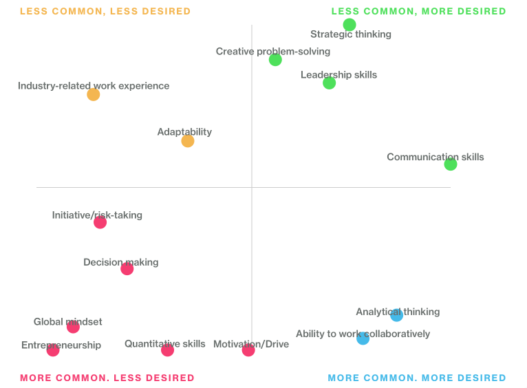
Which way is up? (Answer: down is up)
Looking closer, it appears that Skill Desirability increase from left to right, and Skill Frequency increases from top to bottom?! Graphs should be drawn so that UP means higher. In any case, it should not take prolonged inspection to deduce which variable is on the X axis.
The graphic also manages to make as many schools as possible look good at something. In Financial Services, the top 3 schools for Communications skills are listed as Tuck, McCombs, and Kellogg. But in Technology, the top 3 schools change to Fuqua, Haas, and Kellogg. And for Consulting, the top 3 are London, Harvard, and Ivey. Since “Communication Skills” are the most desired skill of all according to the graph, eight schools can say they are in the Top 3 for teaching the most sought-after skills.